
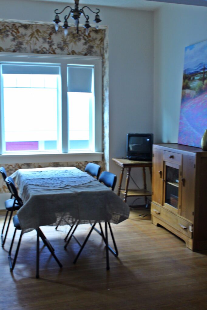
This photo pretty much sums up the dining room before:
More wallpaper and kind of boring. We’ve been using the grey, white, and yellow scheme in the house, and thought the dining room was a good place to take some design risks. Enter in some grey paint and crazy yellow accents and voila:
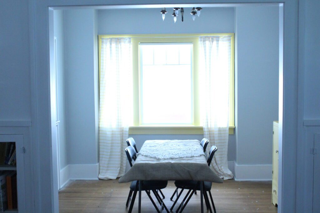
Lately I’ve been seeing designers use strong colours on the trim of the focal window, so I thought I would give it a try. I’m not sure I’m 100% happy with the look, but I’ll live with it for awhile and if I really regret it I can always paint it back to white.
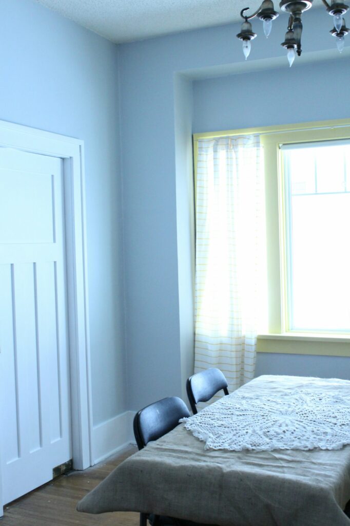
One of the features we love most about this dining room is the swinging door pictured here. We were originally going to take out the wall between the dining room and the kitchen, but later decided against it because we loved the door so much. You can also lock it in place both ways, which is pretty cool!
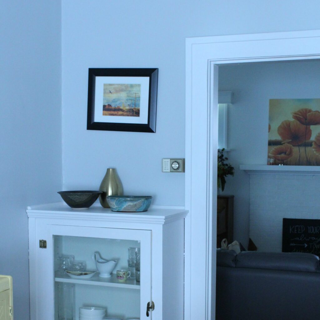
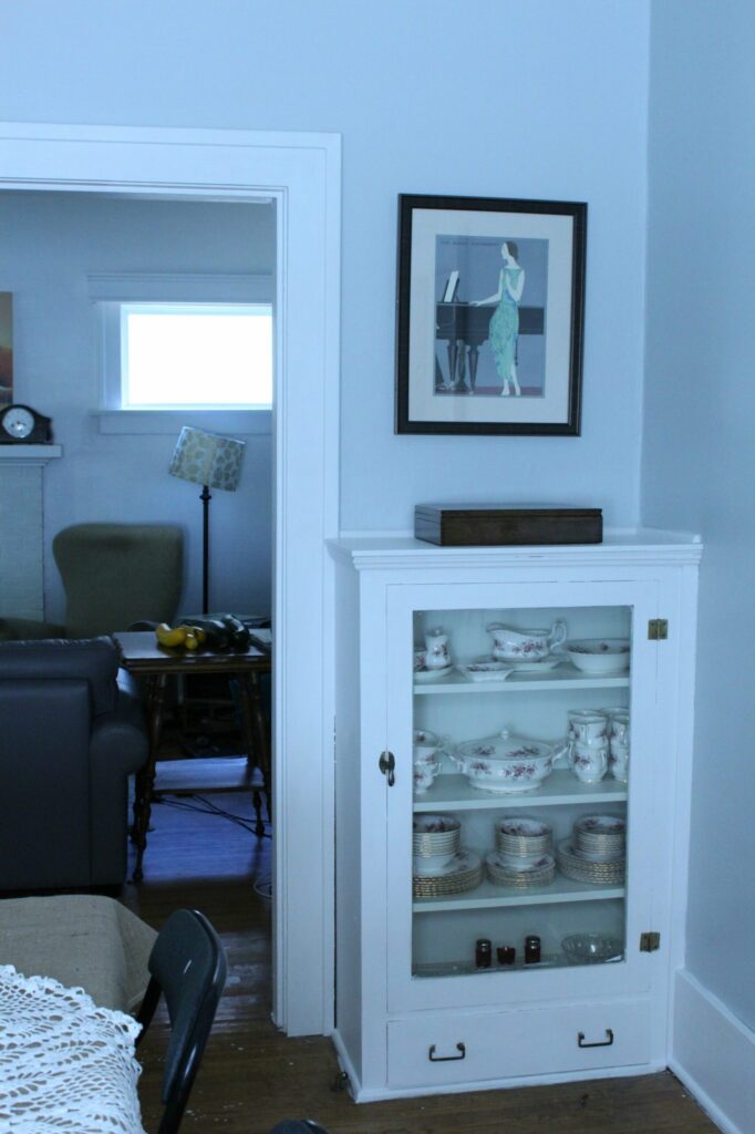
We also really love the two built in cabinets, although they don’t conveniently hold modern sized plates. We just barely squeezed in the Royal Albert.
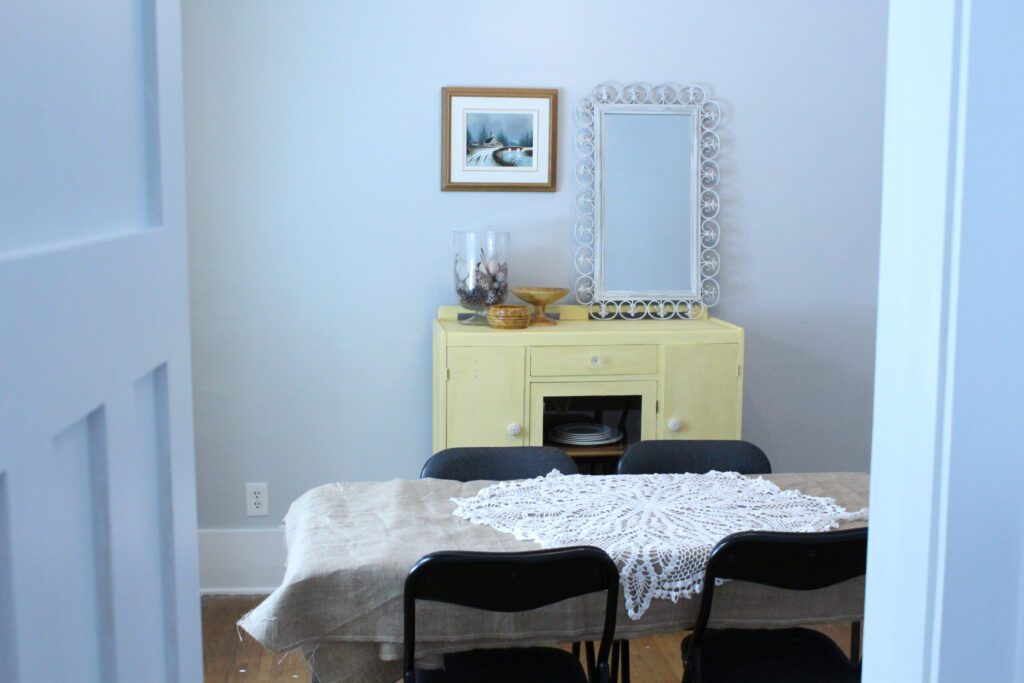
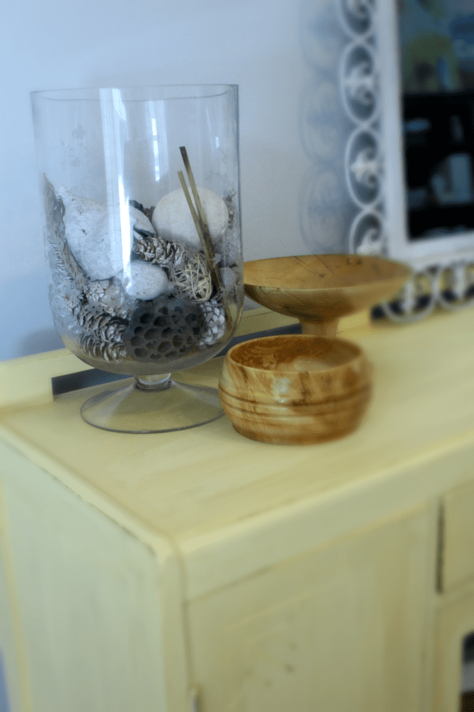
I experimented with chalk paint like its actually meant to be used on the hutch. More on that in the next post. I also painted the mirror white because it didn’t seem to really fit in anywhere else in the house. The painting is a $7 find from value village.
It was pretty fun an easy to distress the hutch. I’ll definitely be trying more of it with the bookshelves in the living room.
I’m still not 100% happy with the way things look, but having an actual dining set would help immensely. This grey is also pretty deceiving. In some lights it is bluer than I wanted, so either it or the shade of yellow will change, unless I can magically find some piece of cheap artwork to tie things in better.
What do you think? Is the window frame too bold or just right? Would you switch out the grey? Maybe go with all white and paint our future dining table grey? Or should I stop obsessing and just be happy?

Rita
Audi